16th November 2023, by Yi Ting Lee
Artists-in-Conversation: Celia Dowson & Chloé Bell
Of Water, Nature and Collaborative Practices

Celia Dowson and Chloé Rosetta Bell in discussion for the exhibition 'Of Water' at Maud & Mabel, 2023. (Courtesy the artists).
Celia Dowson and Chloé Rosetta Bell work with different materials, processes and in disparate environments, creating distinctive pieces embodying each of their artistic interests and philosophy. And while the artists’ works appear dissimilar, the pair have collaborated on various occasions – including for the group exhibition 'Of Water', on view at Maud & Mabel from 2nd to 18th November. Underlying their works and unique friendship is a shared dedication to their craft, practice and belief, including a mutual connection to nature. The two artists speak to the Maud & Mabel team about the exhibition, their workspace, processes and inspiration.

From the 'Of Water' series by Celia Dowson and Chloé Rosetta Bell, 2023. (Courtesy the artists; photograph Josephine Cottrell).
How did you collaboratively come up with the theme of ‘water’ for an exhibition showcasing both of your works?
Celia: One of the things we all felt very connected to within our lives was water. It was a very natural conversation – Chloé was obviously talking about the island and the sea, and I was interested in how I observe water and look at colour and reflection.
Chloé: We both have a very strong connection to natural landscapes, and it happens to be that Celia’s often by water. One of our strongest connections is that we both have a love for natural landscapes, even though we both lived and worked in London for a long time – especially Celia. Our connection together is being outside.

Glass pieces by Celia Dowson and ceramic work by Chloé Rosetta Bell. (Courtesy the artists; photograph Josephine Cottrell).
Celia: When I see Chloé’s posts and she’s by the water in this amazing wild space being inspired and making her work, I just want to go there and plunge myself in. But then there’s also parts of London which shape the way I think about water and landscape. People often ask me how I feel working in such an urban landscape when my work is so much about the natural world. Well, we’re still in it, you know, just because it’s urban doesn’t mean it’s not there. It’s about being attentive and observational. For me the River Thames is an amazing space to feel really connected to water, flow and nature, and it’s just right on our doorsteps.
For so many people, being out of London is a real luxury so it’s about making that nature accessible to people. This isn’t necessarily what the exhibition’s about for me, but the idea of urban-nature allows people who maybe don’t leave London to actually understand that nature is around them everywhere. They just have to be able to tune in.
How does your work and practice resonate with the concept of ‘water’?
Celia: Chloé and I had some really good conversations when we were away together about how our practices connect, because in some ways they’re really different. Chloé’s very much about materials that come out of the water and grow within the water. It feels very much like a process of working with things that exist within water, whereas mine is much more about surface and experiences of depth and light. What we’re both attuned to is this idea of observation – using that word, we were able to reflect on our own and each other’s practices.

Glass cup by Celia Dowson and ceramic plate by Chloé Rosetta Bell. (Courtesy the artists; photograph Josephine Cottrell).
Do you see similarities and differences in the way you approach making works?
Chloé: As Celia said – the question of light and colour doesn’t apply to my work at all, because I never know what colours are going to come out of the kiln. That’s probably one of the most simultaneously rewarding and unrewarding things of my practice.
The last time Celia and I worked together, it was because I was working with a natural material that just wasn’t giving me any colour or depth – I felt such frustration towards the work coming out of the kiln. I remember calling Celia and saying, ‘you have to make your glass to make this work.’ There’s such depth of colour in Celia’s work and the way that light moves through her glass captures the essence of a landscape for me in a way that my work can’t.
I can’t control whether my final work is going to be green, or orange or brown when it comes out of the kiln because the materials really do come from the landscape. For instance, I had no idea that the fossilised wood brought up in the lobster pots from the seafloor, which is used in this collection, was going to be blue and gold when it melted in the kiln. It was a coincidence. I didn’t even know if it would melt or if it would just do nothing. I don’t know what the glaze finish is going to come out like from the kiln, but I’m very controlled in what the form is going to be. That’s probably the most design side of my work. I’m very specific about how I want the shape to look.
 Glass works by Celia Dowson and ceramic jar by Chloé Rosetta Bell. (Courtesy the artists; photograph Josephine Cottrell).
Celia: I suppose that’s a similarity in the way we work, we’re both very much focused on form. Chloé’s way of developing form and the processes she uses are very natural and organic to the material. She doesn’t often tell people, but she uses a kick wheel quite a lot of the time, which is really a very, very hard process and you need to be incredibly skilled as a maker to throw a pot on a kick wheel. I suppose you look at how material cases form, whereas I’m very much about how form will allow light, or glass, to change colour. My form is all about depth, whereas yours is quite often about surface.
Chloé: We met recently to speak about the collection and work on some collaborative pieces, and because we’re both form led, we were able to work well together to develop a series. Whereas if someone approached a collaboration led by the material without knowing what the final form was like, I would be like, ‘don’t you want to know what it looks like so that we could make it work together?’ I think our joint form-connection enables us to work really well together.
 Ceramic piece by Chloé Rosetta Bell (left); glass works by Celia Dowson. (Courtesy the artists; photograph Josephine Cottrell).
It’s so nice to see the both of you have such a good relationship – in terms of your friendship and also in a professional setting. Could you share with us how your friendship, or collaborative relationship, developed?
Celia: Chloé and I were in different years at the Royal College of Art; I graduated just a year before her, but we didn’t really talk to each other then – it’s strange how education schooling does that, because you’re in a different stage, and Chloé’s a very peaceful person. Chloé, I remember being really intrigued by your practice because you always had such beautiful images, paintings and drawings; your space was always set out in this amazing, ritualistic way; and the way you capture your process is so beautiful. Everything about it is really thought about. And then you had my desk on the other end, which was absolute chaos and mess as always, where everything feels like a big mishmash of stuff, and then somehow I produce something which is quite minimal.
But our friendship did sort of develop – I think the first time we contacted each other was when I was doing a residency in a school in London and Chloé asked if I could put a piece of her work in the gas firing kiln there. After that we were also working together for a little while in a gallery. I think you’re [Chloé’s] just a really nice person, so it’s very easy to find a comforting place to work with you and talk to you. It’s a nourishing friendship, and because it’s such a nourishing friendship and we have similar interests I think that’s probably what’s made it grow.
Chloé: Also we probably have spent more time with each other than you would normally spend with a friend, because when I travel from the island to London, I stay with Celia. So we have long gaps where we don’t talk and then we have a really intense period together.
Celia has a really beautiful and very peaceful home full of amazing objects which inspires conversation and then we catch up on our practices. So even if we might not speak for a long time, when we come together it’s a fueling of ideas and checking in to see how each other’s practices are going, which has been a lifeline.
 Celia Dowson and Chloé Rosetta Bell in discussion for the exhibition 'Of Water' at Maud & Mabel, 2023. (Courtesy the artists).
Celia: I think that’s part of it as well. When Chloé and I are together, it’s just a nonstop endless chat, and then she won’t see me for a month again.
What’s really special about our friendship is that there is no demand. It’s very open. At the beginning of this project, we decided we could not make a collaborative piece because it might just feel really forced. As we started to develop our ideas, we changed our minds and thought that our materials would work really well together: Chloé uses this beautiful copper plating on some of her works and that kind of echoes some of the colours I’ve been working with recently. Our collaborative piece came about really organically and naturally – there was no demand from either side.
Chloé: We experienced an exhibition, which was a collaboration between two artists, that just didn’t work for us. When you force two materials from the start and decide you have to collaborate and work together to make a piece that has both materials, it removes the essence of what the exhibition is about. If the exhibition is all about observing water and being in that place, then trying to force work into that rather than organically letting it come out for your practices just doesn’t feel natural. So when we came to meet at the end of the research period, it was like, ‘oh, but this could work’. It was really natural and felt like it was about observing water, because it’s the two ideas coming together in one piece.

Collaborative piece rom the 'Of Water' series by Celia Dowson and Chloé Rosetta Bell, 2023 and ceramic jar by Chloé Rosetta Bell. (Courtesy the artists; photograph Josephine Cottrell).
What is it like collaborating with each other?
Celia: The first time we collaborated was when Chloé invited me to her show in the summer of August 2021. I was asked to make work with not a huge amount of time in advance but it was great!
Chloé: Can I just say that you were very generous in the amount of work that you made for me. I mean, Celia sold out so it went very well!
Celia: It was incredible to be invited to the exhibition. Chloé’s incredibly generous, always, with makers. It’s quite nice that the materials are so different. Often in shows where there’s one material, there’s a kind of competition – I don’t think artists would like to think of their work in that way, but as a viewer your eyes are drawn to a form and quality you like about a material and sometimes other things don’t get recognised.
It actually really made me think when Chloé invited me to work with her for the exhibition in 2021. Chloé, you talked about the quality of different materials coming together, and the strength that can bring. That’s really changed how I think about materials coming together from different lenses in an exhibition: what the materials can do and how they are achieved differently from different processes. Often you suddenly see the similarities and differences in materials when they are displayed under the same theme. It allows people to question more about what they’re looking at. The works aren’t competing, instead it’s collectively enhancing an idea.
Chloé: I think they elevate each other. I knew when I asked Celia to work with me, that her work would elevate the exhibition altogether. That’s the whole material concept. When you view it as a whole without focusing on a singular material – walking into the exhibition space – our materials very much combine and enhance each other and elevate the whole concept, which is why I think we were so happy to work together on this one. We get to work together from the start rather than at the end.

Glass vessel by Celia Dowson. (Courtesy the artist; photograph Josephine Cottrell).
You both worked in London for a while, but are now based in such different environments, though you seem equally inspired by nature. Do you think your surroundings shape your work?
Chloé: We both had the experience of working and studying in London while we were at the RCA, but I immediately moved back to the Isle of Wight after that.
Celia: Did you grow up on the island?
Chloé: Yes, although most of my life was in Leeds so it was my later life that was on the island. But I’ve always come back here and lived here. I love being by nature and I have to be by nature to make work. I feel really uninspired if I don’t have that connection to be able to go out on the cliffs or be by the water, it doesn’t make sense for me to make without that.
Celia: I was born in London and sort of grew up here, but I was very fortunate to have family scattered all over the world. My grandparents lived in Norfolk before they passed away so I basically grew up as a child in Norfolk next to the River Waveney, right on the Norfolk Suffolk border in a place called Geldeston. I grew up outdoors: I was allowed to mess around, climb trees, hurt myself, make mud pies, and go and run around in the garden.
I’m quite solitary here in London I would say. I have close friends – a pocket of them – but I spend a lot of time in my studio and walking with my dogs by the river. Maybe not so much when I was younger, but now that I’m in my early thirties I find that really nourishing and inspiring. Yesterday I got off my bike on my way to work and watched a bird murmuration which lasted for about twenty minutes. Everyone else was on the Battersea Bridge and there was the noise of London behind me, but it was really meditative and beautiful.

Clay vessel by Chloé Rosetta Bell. (Courtesy the artist; photograph Josephine Cottrell).
Can you tell us about the spaces you’re in and how you engage with it in your work?
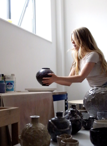
Chloé: We are both invested in curating spaces. In Celia’s room or living space, everything that’s in there is considered and is there for a reason. I find it difficult to make work if my studio is messy. When people have come to photograph my space, I think they’ve been really disappointed because everything is cleaned away and ordered. They expect to see creative chaos, but I just don't work that way.
Celia: You shuffle things around as well. When we went away together, I’d wake up in the morning and see you in the kitchen shuffling things. It’s just so beautiful and nice, because it’s very much you so I just let you get on with it! But everything is put away, and a glass would have been put out with flowers that were freshly picked. Everything’s done with intention and care, and I think your practice is exactly the same. I love when Chloé curates my work. I find curating my own work really hard because it’s not really about the individual piece, it’s been about the process and letting go.

Celia Dowson's research images. (Courtesy the artist; photograph Celia Dowson).
More and more in my practice, I realise that I don’t know whether ‘inspired by the landscape’ is the right term for me to describe my work. It’s much more that I witness things so when I make work I’m aware of how those movements and flowing forms happen within a material context – I find parallels and similarities. It’s about being observant of spaces, landscapes and colours, and then being observant of the processes, materials and making. You can learn a lot about what’s happening out there through what’s happening here within the studio, especially with colour. I think that happens more and more within my practice. It’s very much about learning for me.
How does that shape your practice?
Celia: The results often surprise me. I’m sending a piece of work to Karen that I’m really, really excited about and planning to enhance and develop into bigger work. It’s a surprise happening: I was studying water and over the past year, I’d been taking loads of close-up photographs of droplets hanging on spider webs. They’re beautiful, magnificent. I wonder, ‘How is the material doing that? What’s the tension?’ One day I was making a form and engraving grooves, and air pockets got caught where the plaster touched those grooves, creating little spaces for the casted glass to fall in. They make droplets of glass that hang off of a sculpture. That’s something the material has given me – I haven’t defined that. That’s the material-led process I love.

Glass pieces by Celia Dowson. (Courtesy the artist; photograph Josephine Cottrell).
Celia, what’s your favourite element about Chloé’s work?
Celia: Aside from the beautiful work that Chloé makes, I think what’s really special is that it’s not just about her. It’s also about the way she engages with materials, the landscape, the space that she’s in, and, importantly, the community. Chloé’s always working in conjunction with a chef, fisherman, or someone else. There’s a whole connective idea in the way that she works, which is really important to her practice. I think that’s beautiful, because she’s not just creating pieces in solitude but it’s about everyone and everything else that informs the landscape and space. I think you’re quite a connected person, Chloé, in that you’re always drawing people together: artists, furniture designers, glass artists, ceramicists… because you see how things can work as a whole.
Chloé: At the start of my practice, I was very zoned in. I wanted to be the maker of beautiful objects that would be in people’s homes. Then I got really fed up. I just didn’t want it to be about me. So I moved to Paris for a while and worked for a designer called Marlene Huissoud and assisted her in her practice. It had very little similarities to my practice. But I greatly admired the way she was working with natural materials. I had never experienced her methods and found it very inspiring. I thought it’s beautiful the way that she develops these natural materials into projects. It was something I wanted to capture in my own work.
 Chloé Rosetta Bell's research image. (Courtesy the artist; photograph Chloé Rosetta Bell).
I’m really drawn to people who have this innate connection to a landscape, who absolutely depend on it and have to live off that landscape, like the fisherman for this collection. This morning he was out at 5:30am and yesterday he was out at 5am, because when he went out at night the light had faded and it’s dark so he couldn’t see the lobster pots. My work is about these stories and the connection of really knowing the people who love and work with that landscape. I want to let other people know their story too, that it’s somebody’s normal livelihood to be dependent on that environment.
My objects try to be a connecting point between these conversations, not in an elevated and otherworldly way, but I really want my objects to be a record of a time, place and people. They’re very much of the moment that they’re made in. This collection is my first collection that isn’t a single edition – in the sense that, when I finish all the other projects, I never return to them and that’s it. But this collection, the Undercliff Collection, is my ongoing conversation with the land and the people that live in it, because I want it to be the documentation of the life and practice that’s ahead. This is just the start of that.
Celia: It’s about how things change and move as well. The island’s going to go through changes and there are new people that come in now as well. There’s going to be never-ending stories you can talk about within your work. That part of your practice is, like you said, documentative. A lot of the images you take almost look analogue and the way that you document your process as well – it’s all interconnected.
 Ceramic work by Chloé Rosetta Bell (left); Chloé Rosetta Bell's research image (right). (Courtesy the artist; photograph Chloé Rosetta Bell).
And Chloé, what’s your favourite element about Celia’s work?
Chloé: Celia’s objects are so incredibly, beautifully made; every single step is so considered, and full of knowledge and care in the way that she makes. Everything is documented in a beautiful way in a book, and there’s her drawings and colour samples and all the tests. They do so much more than just be the physical form of the glass objects themselves – they have such depth and colour. They are very ethereal for me because they transcend their forms. The way they capture light and colour is so beautiful, especially when it’s displayed in the right space.

Celia Dowson's work process. (Courtesy the artist; photograph Celia Dowson).
Celia: I’m mostly interested in allowing materials to speak, and Chloé you definitely do that through many different ways. Your colours are often unexpected, whereas mine is very controlled. To an extent, the only time I feel really, really free in making is when I’m making the form, so when I’m on the lathe carving things, and that’s the process I always talk about as sketching. Drawing is gestural and that doesn’t necessarily need to be how we actually draw a picture. My process of developing form is always really intuitive. I might have an idea of a shape, but it will always change because of the wax and the way it behaves; because of the speed of the machine; because of my temperament… Then, like Chloe says, the rest is quite controlled. I can control colour and a lot about what I do. The reason the forms are so simple is because I want to reduce everything back to the essential, which is colour for me.
Chloé: But at the point in which it goes in the kiln, that’s not something you can control, right?
Celia: Absolutely. That’s all about materiality, which defines the depth. In a sense, I can control colour if it’s a solid form; I can get a really thin gradation based on how thick I leave it in certain places. But I can never be wholly in control when I’m working with frits and powders and mixing colours. It’s about how it melts. The shape of the form will allow the material to flow in a different way. A bit like how you look at a river: if there’s a rock in it, water would move around it. It’s the same principle.
 Celia Dowson's research images. (Courtesy the artist; photograph Celia Dowson).
How do you position yourselves as artists or makers? Do you have any artistic inspirations? How has your artistic journey differed or been similar and where do you see this going?
Chloé: I recently got asked on the spot at my last exhibition, ‘Who do you admire most as a ceramic artist?’ My mind went totally blank because I’m more inspired by people who are experimenting with materials. If you asked me about who I’m inspired by in terms of people working with natural materials, I can immediately say formafantasma, Marcin Rusak, Marlene Huissoud or FOREST + FOUND. I love the essence of their practice, the way they study materials, and the freedom they have to make objects that don’t need to have a function. They have material investigation at the heart of it and that’s really what I love and admire.

Chloé Rosetta Bell applying slip on her ceramic piece. (Courtesy the artist; photograph Chloé Rosetta Bell).
I don’t like positioning myself as an artist, maker or craftsperson, or a potter, or a production potter… I don’t like using those words because, I guess, I’m an artist with a practice that studies materials, people and landscapes, and that just evolves naturally as it is. What you think about that, Celia?
Celia: I think if I’d find it really hard to answer who my favourite ceramicists were. Perhaps I’d find it easier to answer for glass artists, but mainly because there’s specific people in my life who made me interested in it. It’s more that I look at artists who explore flow and embody a movement within their work. I’m really interested in people who embrace the physical qualities of a material and are able to manifest that within their work.
 Glass pieces by Celia Dowson. (Courtesy the artist; photograph Celia Dowson).
It’s an interesting question to think about how I position myself…it depends on the context, really, doesn't it? I’ve worked a lot with restaurants and very closely with a lot of chefs in different ways – there’s a parallel there, Chloé has worked with restaurants and chefs as well. We both worked in making one-off pieces that are very special for a specific idea, a specific chef or restaurant, but I would never call myself a designer, really. Or maybe I would. But maybe in that context, I’d refer to myself as an artist. If I’m talking to someone who explores material or is a maker, I’d say I work with glass and ceramics. It’s very dependent on the context of the conversation. I don’t solely define myself as one single thing. I find that whole conversation really difficult to get my head around, and also I’m like, ‘who cares?’
Chloé: I have moments when I wake up in the night and I think, ‘I said I was a maker, they’re probably going to think I’m a production potter, but maybe am I a production potter because I work for a chef? Does that make me a production potter? But then I actually love the artistry of working with material…’ It’s just too much!

Piece from the Undercliff Series by Chloé Rosetta Bell. (Courtesy the artist; photograph Josephine Cottrell).
Do you foresee future collaborations?
Chloé: We can't really share what's going on, but hopefully two projects.
Celia: One of them is an invitation from Chloé again, because she’s always inviting people to work with her. The other one is a collaborative exhibition. I’m quite excited about this because even though, well hopefully, you can recognise our work, it does change and move through different forms and qualities. So it’s an exciting thing to look forward to: In a year’s time, what are the forms you’re going to be making? What are the glazes that you’re going to have developed? Who are the people you’re going to have worked with? How are things going to change?
With water, it is this flow and movement and constant change. It’s never stagnant. It’s always going on and moving forward. It echoes the way you talked about your Undercliff Collection, Chloé, you were talking about how things change with the spaces and the people that you’re working with. And then I think about that in terms of our relationship to being artists, and we’re doing exactly the same thing with changing and growing. It’s quite interesting to think about how our practices might develop separately or together in the future and what that might look like.

Ceramic pieces by Chloé Rosetta Bell and glass works by Celia Dowson. (Courtesy the artists; photograph Josephine Cottrell).
]]>


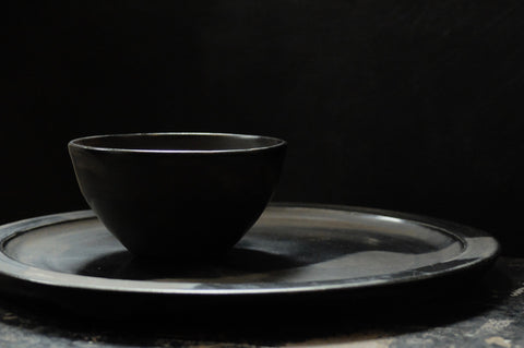
 Photoshoot of Ceramic vessels by Mizuyo Yamashita for Maud & Mabel. (Photograph Josephine Cottrell).


 Soda-fired vessels by Jack Doherty sitting in the kiln (photograph from Doherty Porcelain)